
![]() One of my teachers, Steve Martin, just had an exhibit of his pots at the Koa Gallery at Kapiolani Community College in Honolulu. I took some photos and thought I'd share a few of those with you. In the near future I plan on adding a new page to the website that will highlight the work of local ceramic artists, and Steve will be the first one. I'll include only a few photos now and share more when I start the new page and look at Steve's work more closely. 
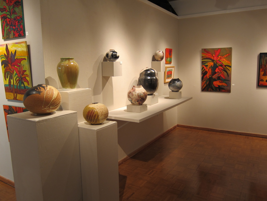
Steve is well-known for making large pots and has more recently been exploring different techniques for pit firing his pieces. 
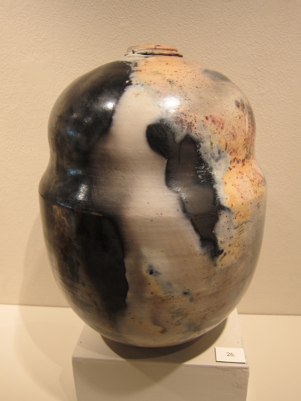
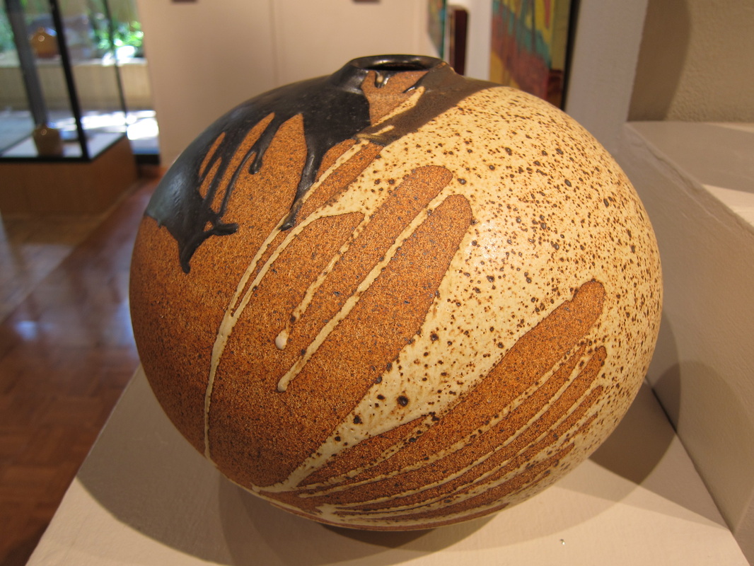
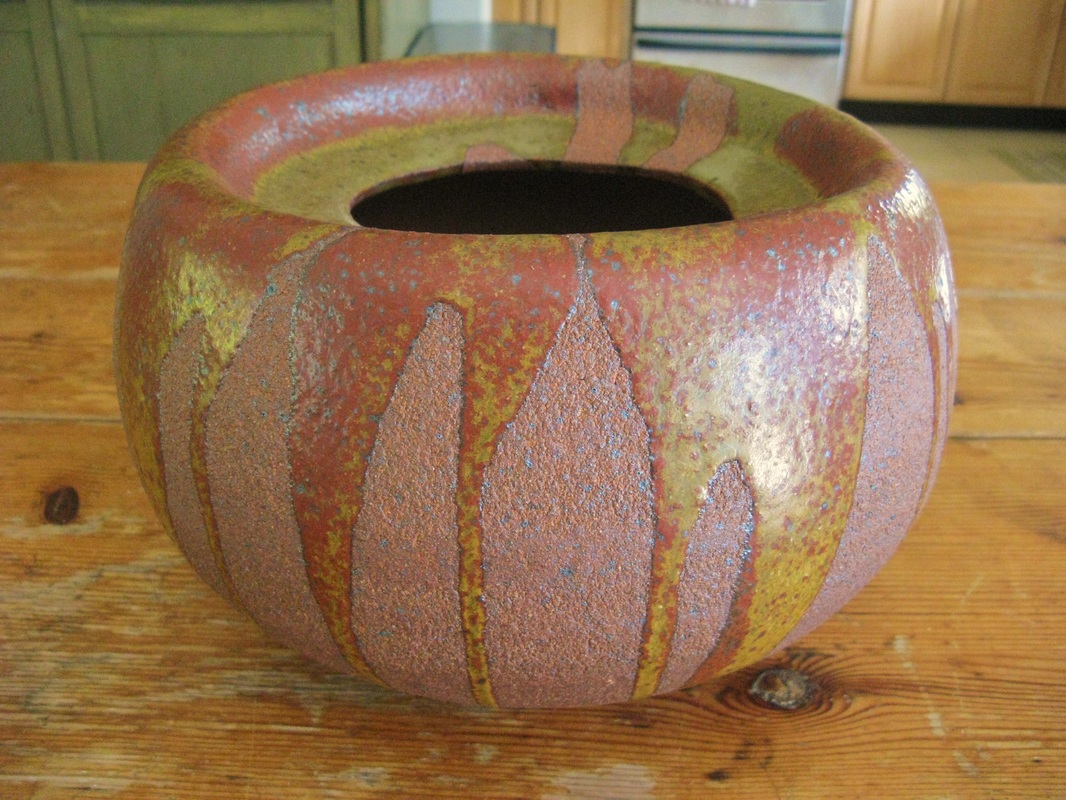
Here's an example of a large pit-fired piece. The black comes from heavy reduction where the pot was lying in fine sawdust. 
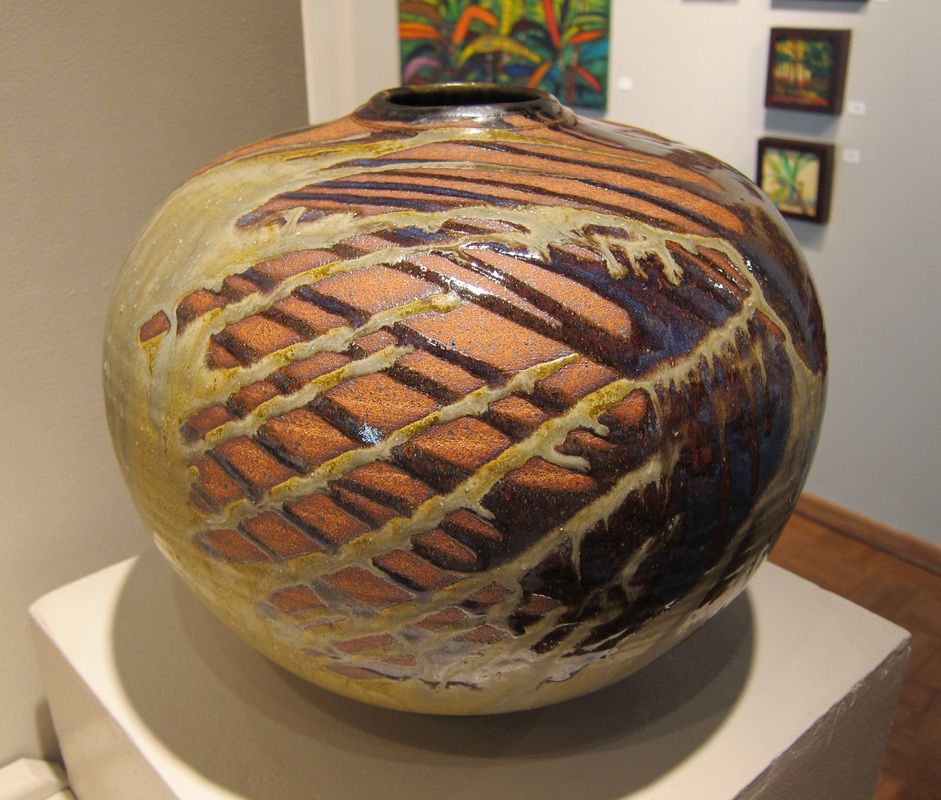
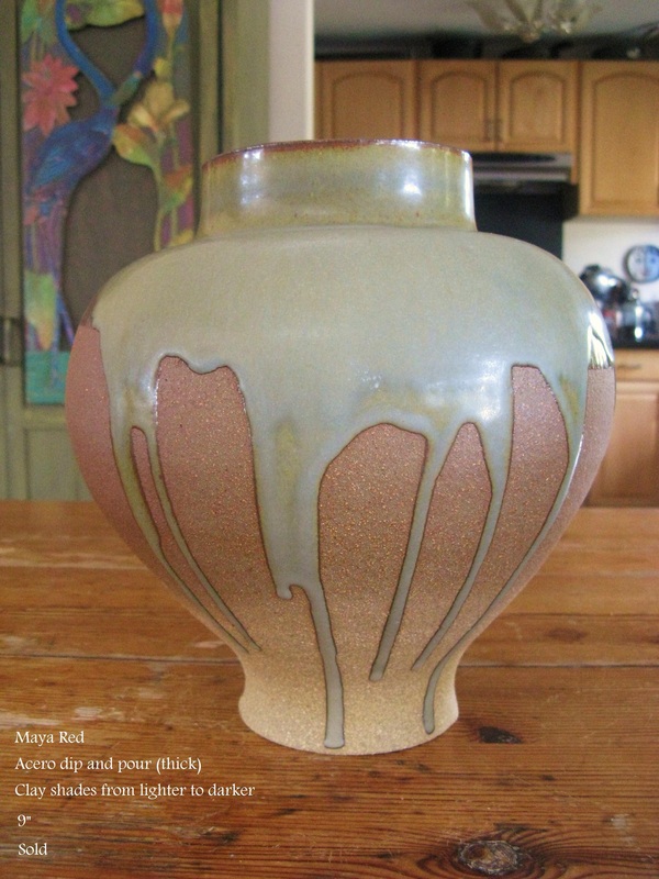
This is a large pot that was fired to cone 10 in a reduction atmosphere. Steve made the pot more dramatic through his glaze application: holding the pot sideways, pouring glazes on one side, and letting the glazes flow in rivulets to the other side. 
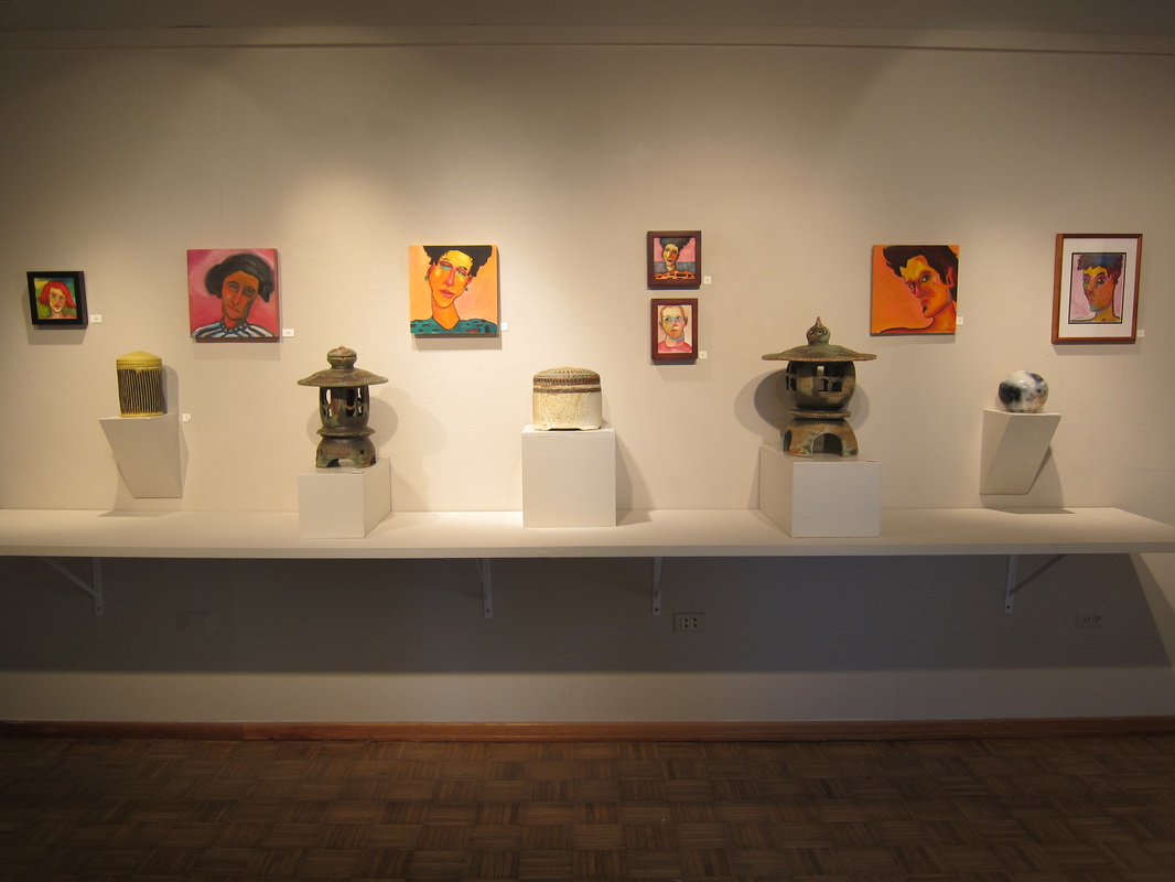
Steve's also well-known for his Japanese lanterns, a form that's used in people's yards throughout Hawaii. 
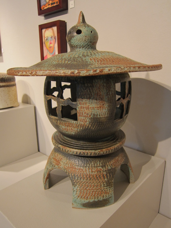
Here's a closer look at a lantern that's been glazed with Joe's Green, one of several varieties of blue/green/black.
1 Comment
I don't know why I took so long getting around to this, but I just went through the monograph for Ken Matsuzaki's May, 2013 exhibition at Goldmark and it was fantastic. If you've seen Matsuzaki's work before, you'll see familiar forms and glazes, but this firing is probably the best of his that I've seen. The pots are stunning! Hats off to Goldmark as well who did a wonderful job of presenting Matsuzaki's pots. One feature I like is that you can zoom in and see the pots at very close range and the monograph gives closeups of several pots which give even more details of how he made the pot and a better look at the glazes. I was so inspired I went back and watched "Elemental" again, the 44 minute documentary Goldmark put together before his 2007 exhibition. It starts with him making chawan, shifts to a lengthy presentation of his seven-day wood firing, and finally ends with unloading the kiln. Phil Rogers, a great potter himself, is the narrator and I shared his excitement as one amazing pot after another began emerging from the kiln. If you'd like to take a look, go to www.goldmarkart.com and look under "ceramics."
![]() I've used four different types of red stoneware: Amador, Maya Red, Death Valley (all three Laguna Clay) and Russian River (Aardvark Clay). For information about the general formula for stoneware clays, see my last blog on Black and Brown Stoneware. Red stoneware gets its color from different amounts of red iron oxide. Like any stoneware with lots of iron, the bisque firing schedule must be organized to make sure all of the organic and inorganic carbon are burned out. Otherwise, during the glaze firing the carbon will take oxygen from the iron oxide and it will become black iron oxide which can cause black coring and other problems. I was reluctant at first to use red clay. I think I avoided it for the first few months just because it looked so messy. It reminded me of my childhood and all the kids who made mud pies. I wasn't one of them. Some of my friends at HPG worked almost exclusively with red clay, especially Death Valley, and everything the clay touched turned red. Their bats were red, their aprons were red, their clothes were red, even their hands were red. No, I take that back. They weren't red, they were orange. When I began using red, black, and brown clays, I set aside two pairs of shorts that I only used for working with clay. I've never had any problems getting B-Mix and porcelain out of my clothes, but dark clays are another matter. If you have any suggestions on how to get stains from iron and manganese out of your clothes, I'd love to hear them. Right now I use the same two pairs of shorts that are already stained and wear them whenever I'm working with clay. I wear an apron also, but that doesn't completely protect my shorts. By the way, I keep saying "shorts" because I live in Hawaii and rarely wear long pants. This summer when I was visiting family in Cincinnati, I had someone ask me what the weather is like in Hawaii. "Let me put it like this," I said, "I don't own a single long-sleeved shirt!" Laguna Clay describes Amador as an "orange/brown moist body" which has fine sand and is "slightly coarse." Maya Red is described as a "medium red clay with 60 mesh sand" and is "medium coarse." Death Valley is a "medium-coarse textured, reddish clay" and has the same iron speckling as Rod's Bod. Russian River is described by Aardvark as "warm orange-brown, very smooth." None of these descriptions is all that helpful. I would suggest trying all of them (and any others you might have access to) in order to determine their qualities for yourself. In my own experience, trying different clays has been extremely important in my creative growth. Each clay begs to be made into different forms and works differently with different glazes and decorative techniques. ![]() Here are some things I've learned about working with red stoneware. First, I haven't noticed much of a difference in workability between these four red clays. I enjoy working with all of them. It seems to me, however, that these clays can get waterlogged faster than other clays I use, so I limit my use of water and slurry. Second, Laguna and Aardvark have formulated these clays to make small to medium sized pieces and that's what I use them for..... most of the time. I've found, however, that you can get some interesting effects if you push the material a little further than it's supposed to go. In the first photo I've included in this blog, you can see a piece I made using Death Valley. Two things happened while I was making this piece. The top of the pot became waterlogged and soft, so I pushed it down inside the pot, and the outside surface starting breaking up and becoming rough because it wasn't made to be stretched this much. I liked the effect, however, and have used it many times since then. Actually, when I was finishing the pot, I started to smooth the outside with a rubber rib but then I caught myself and stopped. "What am I doing?" I remember saying to myself. If you enlarge the photo, you can see a thin band in the middle where I started to smooth out the surface. Third, some glazes look better on red stoneware and some look worse. I've found that many blue and green glazes in our studio, for instance, look great on red clay because of how the iron in the clay interacts with the glaze. Those same glazes look tepid on a lighter clay. One of the glazes at HPG, Pete's Cranberry, becomes a zappy bluish purple on darker clay bodies but is notorious for turning beige on white stoneware or porcelain. The iron in the clay body makes all the difference. One thing I should mention, however, is that glazes need to be applied thinly for the iron to produce more vivid colors. These two photos are good examples because the same glaze, Acero, was used on both. With the first pot, I poured the glaze once and it was very thin. With the second pot, I dipped the pot in the glaze (which usually produces a thicker coat of glaze) and then poured more glaze over the top of that. Laguna is also right about how glazes look on Death Valley. They tend to get large and small iron spots, so don't use Death Valley unless you want that effect. Fourth, glazes with rutile or titanium dioxide usually look good. I've noticed, however, that these glazes turn whitish if they are applied too thickly. Fifth, I try to expose some of the clay body when I'm using red clay because it looks so handsome by itself. In reduction firings, these clay bodies range in color from orange-brown to a dark brown with lighter spots. The first image shows what red clay can look like when it fires to a reddish-brown, Death Valley in this case. In the second image, you can see how the clay (Maya Red) was reduced on the upper part of the pot and oxidized on the lower. This is uncommon, the only time I've had it happen. In oxidized firings, red clays tend to be much lighter in color, ranging from a buff color to a light orange. These differences in color between a reducing atmosphere and an oxidizing atmosphere are not pronounced in other clay bodies but they provide more creative possibilities when you work with red clay. |
AuthorI hope this blog will be encouraging to potters, especially beginning potters, and a source of helpful information and comment. Archives
August 2023
Categories
All
|